How to read this chart
This visualization is an exploration of multidimensional data about trade among NAFTA countries. The charts are connected and interactive; mouse over and click to explore and change them, and consult the explanations below for further detail.
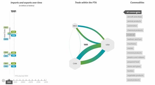
Trade over time
Import and export amounts for each year are shown along this timeline. Solid colors show trade within NAFTA, and striped colors show trade with the rest of the world.
Timeline control
Drag the slider or click the play arrow to move through time
Network view
The network graph shows the import-export connections between NAFTA countries at a single point in time. The width of the paths indicates volume of trade, and the size of the hexagons show each country's relative volume of exports within NAFTA.
Filter by commodity
Click commodity labels to filter the data by commodity type.
About the data
Trade data comes from the United Nations Comtrade website. Dollar amounts are inflation-adjusted to 2015 dollars, using the World Bank's North American inflaction adjustment table. Commodities are classified in accordance with the Harmonized Tariff Schedule taxonomy and are aggregated at the Section or Chapter level, with the exception of crude oil (Heading 2709). NAFTA country trade data is consistently available only from 1990 on, and prior to 2010 is only available at annual intervals.